Keeping Visualisation Sets Consistent in Lighting and Materials
A visualisation set may include overview images, closer views and frames intended for different presentation uses. Consistency does not require every image to look equally bright or repeat a composition. It means keeping approved decisions recognisable: the selected surfaces, the intended lighting character and any deliberate differences between groups. When one image appears out of step, identify which decision needs attention before requesting a change across the set.
Choose a shared comparison reference
Select an agreed reference image and identify useful comparison areas: a readable surface, a lit area and a transition into shadow. Treat this as a presentation reference, not a substitute for a physical material sample. If images represent different lighting situations, name those groups so reviewers know which reference applies.
Compare each revision with both the shared reference and the previous version of that frame. The first comparison checks the set; the second reveals the effect of the latest change. Do not quietly replace the reference because a new image looks more attractive. Changing the reference is itself a decision to record.
Keep a short set note with the reference revision, the lighting group, the selected surface reference and any approved exceptions. A detail image may intentionally prioritise a surface while an overview retains the agreed overall balance. Mark that choice as intentional, including the affected frames, so the next correction does not erase it. Revisit exceptions when the shared reference changes.
Separate four decisions before requesting changes
- Frame: identify the image, marked area and viewing size. A different crop alone is not enough evidence to conclude that a material has changed.
- Lighting: describe the intended change in brightness, emphasis or readability in a specific area. State what should remain as approved.
- Material: distinguish the selected surface from the placement of its pattern. A request about pattern scale needs a readable comparison point.
- Display: identify the exported file under review. Resolve differing file versions before treating a colour disagreement as a problem with the set.
Make material comparisons specific
Blender’s Mapping Node documentation describes translating, rotating and scaling texture coordinates. A useful review habit is therefore to ask separately about pattern direction, scale and position before requesting a replacement material. This is editorial comparison advice, not a claim about CGpro’s software workflow.
Mark a recognisable comparison area in each relevant image. “Keep the surface selection; check pattern scale here” gives a clearer decision than “make it like the other image”. If there is no corresponding area to compare, record that limitation and request clarification instead of assuming a single image establishes consistency throughout the set.
Agree on the viewing file before judging colour
Blender’s ColorManagedViewSettings documentation describes a display transform and exposure applied before that transform. For review, record the export and viewing conditions used as the reference. This recommendation concerns version control; it does not establish monitor calibration or verify a physical material’s colour.
If “too dark” refers to only one copy, compare the same file first. Then specify the viewing goal: which area needs clearer reading, and which approved contrast should remain? This avoids requesting a set-wide brightness change to address one small area.
Hypothetical example: one change at a time
This example is entirely hypothetical: an interior set contains frames A and B. A reviewer wants to retain A’s lighting direction but thinks B’s pattern looks larger than the shared reference. These frames and revision names illustrate a review method; they do not describe a real project or verified additional views of the website proposal.
- Observation: mark the comparison area in B and describe the apparent pattern-scale difference without concluding that the material changed.
- Requested trial: use B-r2 to check pattern scale only, retaining the frame, lighting direction and selected surface as references.
- Annotated approval: “Approve pattern scale in B-r2’s marked area; retain lighting direction. Brightness elsewhere remains open.”
- Next decision: if brightness still needs attention, raise a separate request against the newly approved version and state its scope.
The purpose is to make each approval understandable. If a revision must change several variables together, list them beforehand instead of describing the outcome as a single-variable comparison.
Checklist before approving the set
- Each image group has an identified lighting and material reference.
- Comments distinguish frame, lighting, material and display decisions.
- Requests name the image, revision, marked area and retained decisions.
- Approved details and open questions are recorded separately.
- Intentional differences are labelled so they are not reversed accidentally.
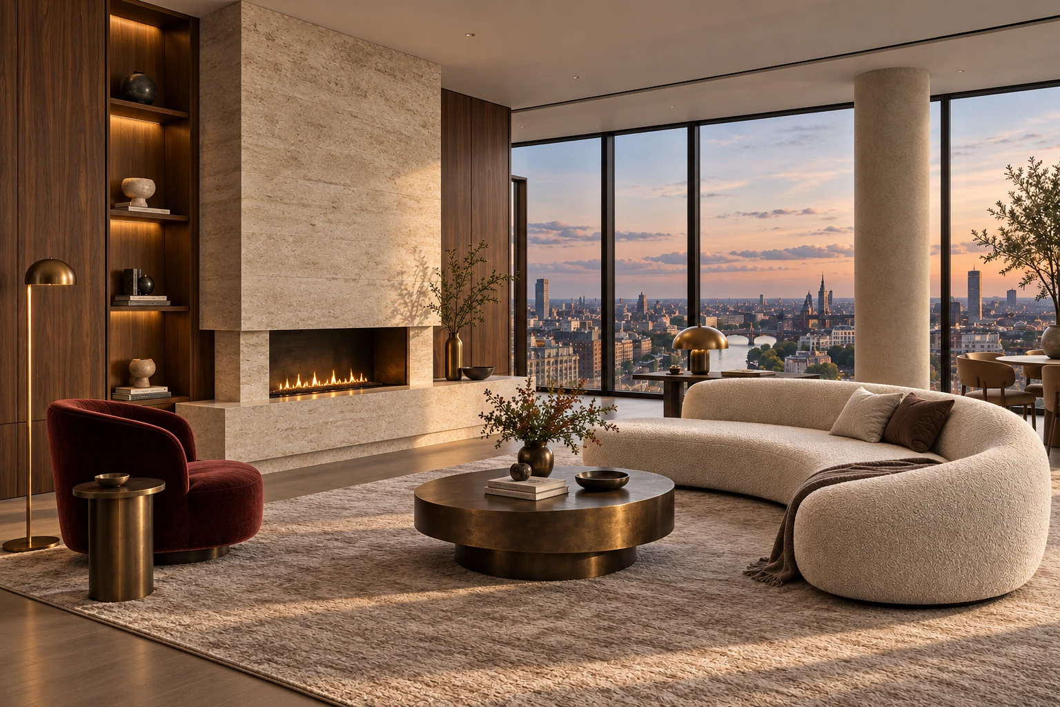
Accompanying illustration: Design proposal “Urban Residence” — European Contemporary, an independent style reference rather than frames A and B from the hypothetical example.
To discuss a visualisation set and the comparisons it needs, contact 0362686877, [email protected] or visit CGpro.