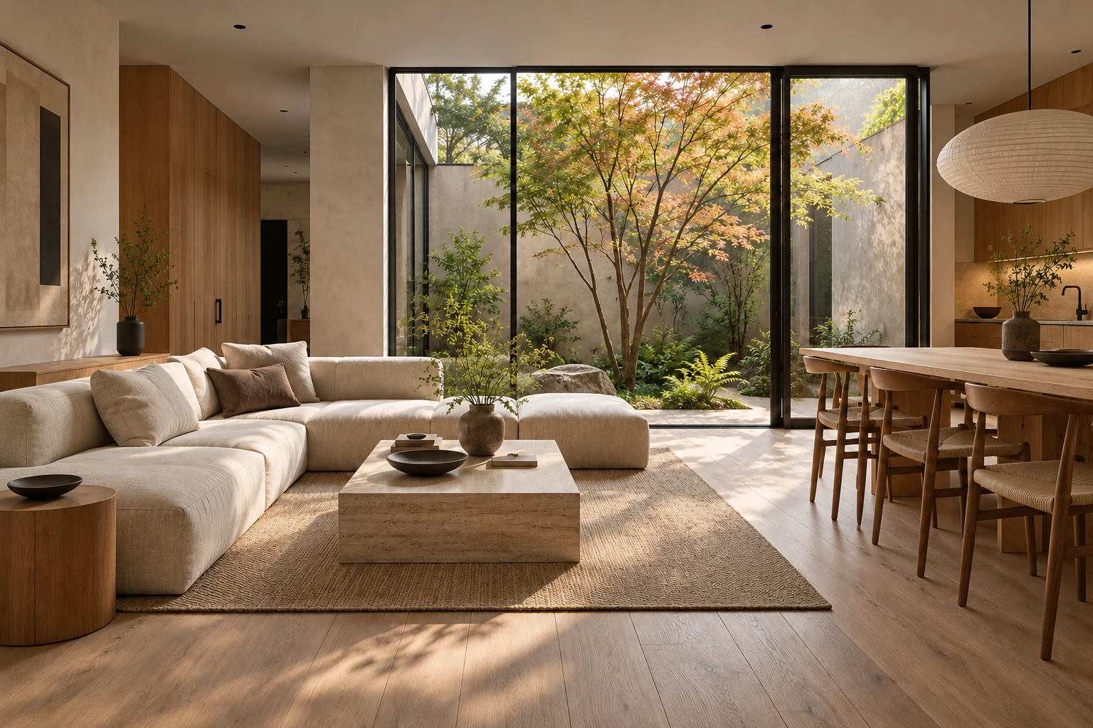
How to Review an Interior Visualisation: Five Practical Checks
A finished interior image often prompts an immediate reaction: calm, convincing, confusing or slightly unresolved. For architects, designers and property marketing teams, the useful next step is to identify what creates that reaction. Five viewing passes can turn a broad impression into a focused review. They assess how the image communicates a proposal. Decisions about dimensions, construction details or buildability still require the relevant documents and specialist review.
Keep a short review sheet beside the image. For each concern, record the marked location, what you observe, why it matters to this presentation and what you want checked. Give the team room to investigate the cause. A useful comment can be a question when the image alone does not support a conclusion.
1. Perspective and geometry: can you read the space?
Start with the whole image at a comfortable screen size. Follow floor edges, ceiling lines, wall junctions and major forms. Mark any junction that makes you pause to understand the space. Does something near the edge appear stretched enough to distract from the intended reading?
In perspective, distant objects appear smaller and parallel lines may converge, as explained in the Blender camera documentation. A sloping edge alone therefore does not establish a modelling error. Describe the concern and ask for comparison with the design intent before requesting a geometry change.
2. Lighting logic: what leads your eye?
Look at the brightest areas, the transitions and the darker parts. Is the reason for emphasis understandable? Can you distinguish the surfaces that matter, or does an area lose information? Review the lighting against the image’s communication purpose.
Replace “make it brighter” with a visible outcome: clarify the boundary between two surfaces, retain a quiet overall mood, or reduce a bright patch competing with the subject. This gives the visualisation team a problem to solve without prescribing an unverified technical cause.
3. Material scale: does the surface support the intent?
Move closer and compare patterns, joints and repetition with surrounding forms. Flag anything that appears disproportionately large, small or repetitive. If a reference sample has already been approved, name that reference when asking for a comparison.
A surface’s appearance does not establish its product identity, physical dimensions or performance. Where information is missing, write “confirm the pattern scale against the approved reference”. That keeps the review question open without accidentally specifying a replacement material.
4. Contact and shadows: do the forms feel connected?
Examine where objects meet the floor, walls or neighbouring objects. Mark an ambiguous gap, a heavy outline or a dark area that makes two surfaces merge. Inspect the location closely, then return to the whole image to judge its significance.
Describe the relationship you want checked: “At the marked point, the form appears disconnected from the floor; please review the contact and local shadow.” Let the team investigate the cause instead of assuming a modelling or lighting fault.
5. Visual hierarchy: what will the viewer remember?
Return to a size close to the intended presentation. Where does your eye settle first? Is that the feature the team wants to communicate? A strongly contrasting secondary detail may compete with a more useful spatial relationship.
Agree one priority for the next revision: what should be understood first, and what should follow? The Japandi direction of Design proposal “Quiet Courtyard” can provide a stylistic reference for discussion. A style name still needs image-specific review criteria.
A short checklist before sending comments
- View the whole image before inspecting details.
- Mark each concern on the same image version.
- Check all five areas, including the intended focal point.
- Separate requested changes from questions needing confirmation.
- State the desired outcome and priority for each request.
- Resolve contradictory comments before issuing the review.
Annotated hypothetical example: making feedback actionable
Hypothetical situation: A team is reviewing an interior image for a presentation of a spatial idea. This example illustrates a review method; it does not describe any CGpro design proposal.
- Observation: The centre feels difficult to read, while a nearby pattern attracts attention. Mark both areas on the same image.
- Purpose: The viewer should understand the relationship between the central forms before noticing surface detail.
- Request: Review the separation between the central surfaces and compare the nearby pattern scale with the approved reference. No material replacement is requested yet.
- Review criterion: At presentation size, the centre should be easier to understand and the pattern should play a supporting role. Keep unresolved points as explicit questions.
For the wider feedback process, see coordinating documents and comments in visualisation. To discuss an already produced image with CGpro, contact 0362686877 or [email protected] with the image version and marked review areas.